KUALA LUMPUR, Oct 8 — The thing about iPhones is they’re very good at doing one thing: “it just works”.
Great for executives who want to make sure their yearly upgraded phones work right out of the box, with their email and their calendars all synced.
For a long time, perhaps too long, recent iPhones feel as though they were designed by committee, by suits who wanted reliable, predictable targets and numbers.
I remember being near-trampled by photographers rushing to take photos of the iPhone X and how excited people were to finally get a new iPhone design.
Still, I don’t agree with that tech reviewer who called the latest iPhones “unreviewable”.
There are things to love, things not to love and things you could learn to appreciate somewhere down the line.
What you need to know
Let’s get down to the basics or the part which you need to read to carry on a conversation about the new iPhones besides what I wrote about in the hands-on.
There are four iPhone 16s—the base iPhone 16, its larger variation the iPhone 16 Plus, the iPhone 16 Pro and its larger version, the iPhone 16 Pro Max.
This time, instead of the non-Pro iPhones inheriting last year’s chips, all the new iPhones will be running the A18 processor, just that the Pro phones will have the Pro versions.
The phones will all have 8GB of RAM, important for running Apple Intelligence as Apple has revealed the main reason last year’s base model iPhone 15 and iPhone 15 Plus won’t support it is because they just don’t have enough RAM.
What the Pro models will have is an extra core for its GPU as well as a higher-spec camera and the iPhone 16 models will have aluminium designs while the Pro models will instead use titanium.
The iPhone 16 models will also come in Black, White, Pink, Teal, Ultramarine but the Pro models will instead have White, Black, Natural Titanium and Desert Titanium.
Most importantly the iPhone 16 Pro models will have the same specs but different display and chassis sizes.
Apart from that, there will be no other difference in specs or features between the 16 Pro and 16 Pro Max, unlike previous years where if you wanted the most powerful phone you would have to plump for the Max version.
Day to day with the iPhone 16
I found it really funny to hear iPhone fans on iPhone Day tell me, very specifically, what colour they wanted and why they absolutely wanted that specific colour.
Black is still fashionable, believe it or not, for the iPhone Pro getters so I would say sometimes it’s hard to beat the classics.
The colours most in-demand though are Desert Titanium for the Pro models and for the iPhone 16/16 Plus, pink.
I was a bit disappointed that generally those not into pink prefered the Aquamarine (blue) iPhone shade to the Teal but that’s taste for you.
While the iPhone 16 Pro Max was my daily driver, I still took along the 16 to take photos, scroll social media before bed and took it around the house while I let its bigger cousin charge.
The new camera design for the iPhone 16 is aesthetically nicer but pic-wise, if you haven’t been spoiled by the iPhone 16 Pro as I have, you would probably say the camera is “just okay”.
While it’s nice that Apple gave the iPhone 16 a better processor as well as more memory, the simple reality is that for a lot less money, the Honor 200 will give you a triple 50MP portrait camera, a Snapdragon Gen 3 processor, a phone that’s just 7.7mm thick and 2.5x optical zoom (the iPhone 16 only has 2x).
Though, given my experience with iPhones and cheaper Android phones over the years, your iPhone will retain a lot of its resell value and be updated for longer so you’re also paying for durability, even if that’s not exactly exciting or sexy.
As to that camera button, I’ll talk a lot more about that later on.
Camera redesign aside, I don’t find the iPhone 16 a compelling enough update from the iPhone 15 (that hums along in my bedside drawer as my dependable second phone).
They’re both decent phones; one is a little faster than the other but not so much I feel enough of a difference. It doesn’t feel as much of a step up of an upgrade as compared to a half-step.
Pleasantly surprised by the iPhone 16 Pro Max
I used to prefer the smaller Pro iPhones but now I have accepted I have large hands (for a woman), the Pro Max just feels natural in the hand.
The new iPhone 16 Pro Max was not what I expected.
It’s much lighter and the way the phone blew up the photo I had as my display wallpaper underscored just how different the iPhone 15 Pro Max and 16 Pro Max screens are.
Now when I hold the 15 Pro Max it feels like a brick compared to the newer phone—or maybe the weight is just distributed better.
Samsung makes great phone screens but I still prefer the colours and the brightness of iPhone displays; they just feel easier on my eyes.
Being able to cram in a 6.9-inch display into the chassis with slimmer bezels might not seem like a big deal but my ageing eyes appreciate the effort.
The software also seems to be more optimised—I did not encounter the overheating messages that I dealt with in previous iPhones.
Even shooting a whole bunch of photos and videos like I did while covering iPhone Day at TRX The Exchange barely taxed the phone and except for a couple of times when it froze, the iPhone 16 Pro Max feels a lot better optimised, more ready to go out of the box than the 15 Pro Max did.
The battery is also very impressive — It was charged before I turned in to bed at midnight, then after a whole day of covering an event from 6.30am in the morning, taking and editing photo and video as well as being a mobile hotspot, the phone was at 30 per cent by 2pm.
That might not sound like a lot but that was with heavy usage and on ordinary days (or the days I was just convalescing in bed) the battery drained very slowly—on a day that started at 8.30am and ended around 10.30pm, my phone wouldn’t need charging till the next morning.
If you know one thing about the Max models is that they will always give you the best battery life and not have you grasping for an extra battery before you end your day.
Oh, the cameras
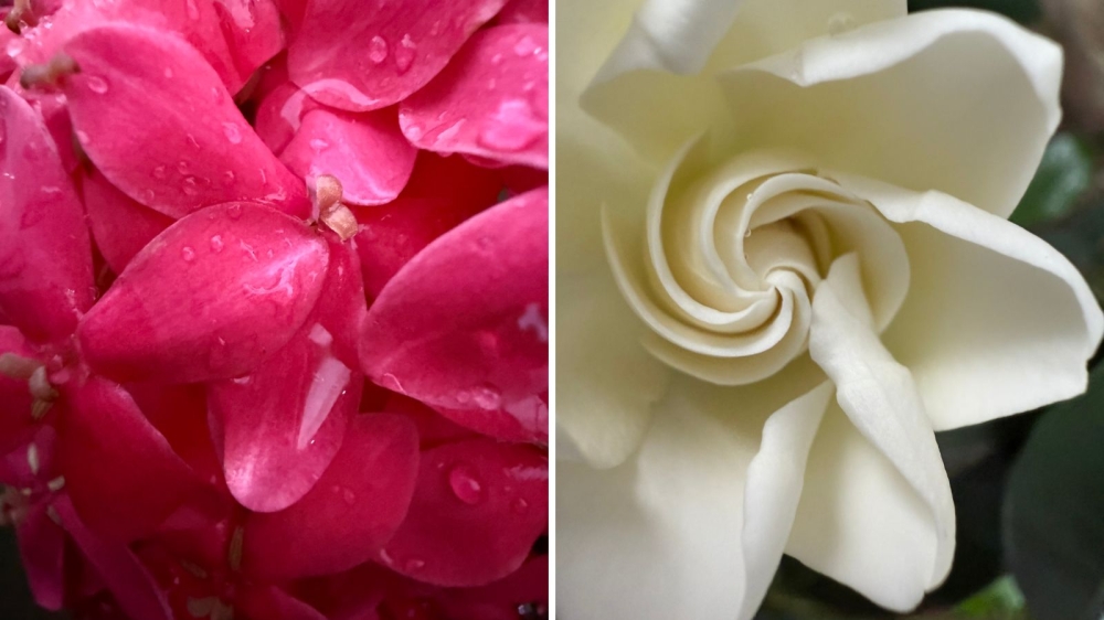
As for the picture quality of the 16 Pro Max, it’s not a huge leap from the 15 Pro Max.
I loved the 14 Pro Max’s pictures, as I did the 15 Pro Max and the 16 Pro Max continues in its vein of pleasing photographs that are a touch better than its predecessors.
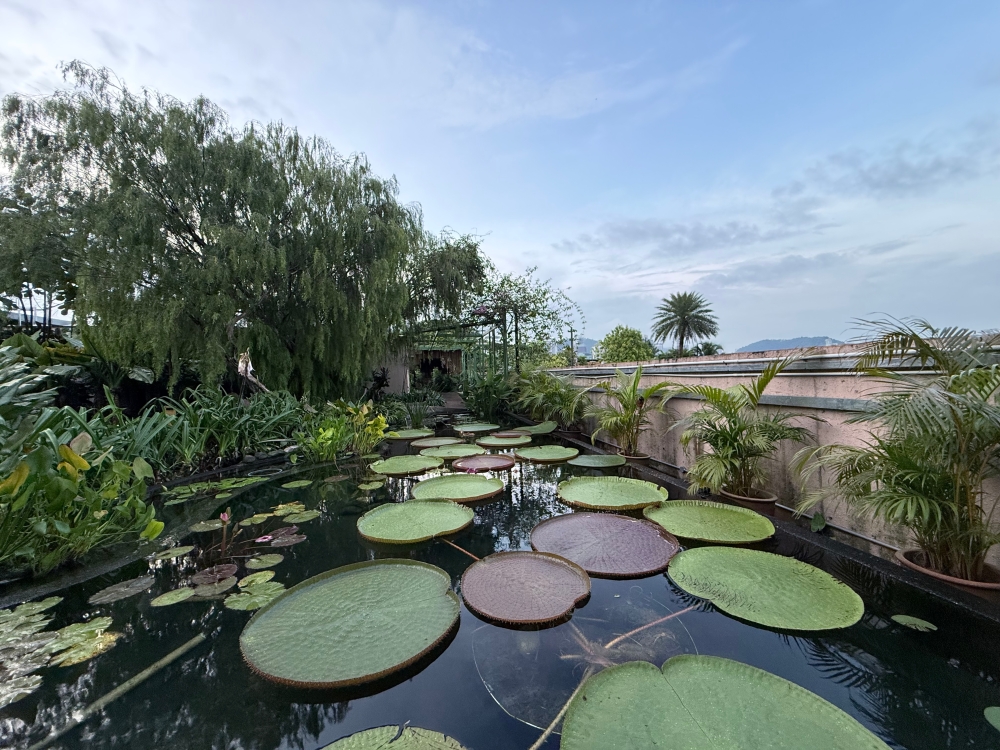
Encumbered by both health problems and time constraints in the last few weeks, I decided to head up to 1 Utama’s Secret Garden at dusk to see what kind of performance I could squeeze out of both review units.
With good light, you can coax good performances out of even the most potato-like of smartphones.
The challenge was to see how well these iPhones could do with very little light and if Apple’s famous computational photography would create pleasing results of overly edited ones.
Unfortunately no matter what phone you have, it cannot possibly win in most indoor restaurants as the lighting is usually sub-par and meant to convince you whatever is on your plate is delicious.
On the rooftop though, I found that the iPhone 16 Pro Max’s default camera was faster than the 15 Pro Max at taking pictures in low light and with Night Mode enabled.
I also really enjoyed taking macro pix with the improved camera, though if you want more control I’d suggest third-party apps such as Halide and I also saw improvement in the wide shots, where before there would be a marked “fishbowl” effect on the edges.
As to that Camera Control button — it’s gimmicky but fun.
I got used to using the camera button more quickly than my usual mode, which was to click on the camera icon I placed on the phone’s display.
You don’t need to use it and it’s simple enough to disable it, but using it meant I was more likely to try out the Photographic Styles.
Remember I said taking pictures at restaurants sucked because of the lighting?
Photographic Styles is a shortcut to making them look better, for instant compensating for either overly yellow or the converse, overly bright and cool lighting by selecting a Style that would compensate.
I was genuinely surprised to be so comfortable with the Camera Control button (but I still haven’t bothered with the Action button, though) but maybe it’s because I’ve gone through a fair amount of camera reviews that it was “just another button” to get used to.
As for video, I’m determined to spend a little more time to see what I can squeeze from the phones so expect another longish writeup about them.
At the end of the day
I never recommend the latest iPhone to people who just got one from the year before and I still can’t do that this time.
The iPhone 16 is nice and dependable, but also sadly boring especially considering all the snazzy, fun features the competition has.
If I didn’t dislike Samsung’s software (and Android) in general, maybe I’d be using a Flip6 (it’s cute, okay) but the new generation of folding smartphones has me leery about their longevity and repairability.
The iPhone 16 Pro Max is a great phone and probably one of the best flagship smartphones right now - there’s a reason why iPhones are still the pick of the influencer set because selfies and videos still just look better online with iPhones.
I would say that if you were upgrading from an 11 or 12 Pro Max, the 16 will feel amazing—more battery life, refined zoom, less surreal-looking ultrawide shots and computational photography fixes that are a bit less jarring.
Still, I wouldn’t blame anyone for waiting till next year, hoping that Apple really does have something more exciting up its sleeve than “hey you can auto-generate hideous images in iMessage now!”
I’m waiting to be excited again.


