KUALA LUMPUR, Oct 27 — It’s hard to believe it’s been 17 years since YouTube went live, and the world’s most popular video streaming platform has decided it’s time for a mild makeover. The company unveiled a redesign that adds some colour to its traditionally minimalist interface, aiming to place even greater emphasis to the videos it hosts.
Ambient mode and a “darker” dark theme
Front and centre is a new “ambient mode” that bleeds a bit of colour from the currently playing video to the rest of the interface — similar to the ambient lighting found on the back of high-end TVs. It’s only available using the dark theme, which is now fully black to highlight this new feature.

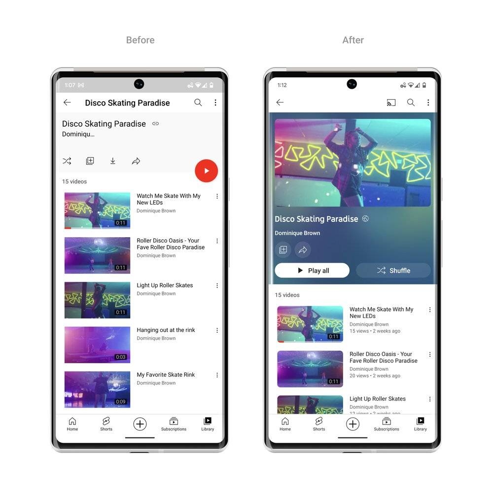
As you’d expect, this effect is only visible when the video is out of full-screen mode. Ambient lighting can also be found in playlists, which also now shows the thumbnail of the top video and additional information that can be gleaned at a glance.
Smaller buttons, larger subscribe button
Other changes include minimised buttons for frequently-used interactions such as liking, sharing and downloading. On the opposite end of the spectrum, the subscribe button loses the red text but has been made larger and more prominent. These detail revisions are new to YouTube’s mobile apps and mirror the design already employed on the web version. YouTube links in video descriptions have also been replaced by buttons.
Pinch to zoom and precise seeking
The revamp is more than skin-deep — the company is rolling out a couple of previously experimental features on mobile apps. The first is pinch to zoom, which as the name suggests lets you zoom in and out of videos on iOS and Android devices — and they stay zoomed in once you let go.
The other new feature is precise seeking, which enables you to finely scrub through a video, in a similar manner to web videos on the iPhone (this seems to have been removed on iOS 16). Simply swipe up while scrubbing and you’ll be able to pick out the exact part of the video that you want to watch — guided by a row of thumbnails at the bottom. The video will remain paused once you lift up your finger, letting you scroll through the thumbnails.
YouTube says the redesigned interface will be rolled out to all users over the next few weeks. — SoyaCincau


