


")


KUALA LUMPUR, June 13 — Logos are instant brand messages brands send to their consumers.
They build brand identity and display the company’s personality.
When done right, logos make a company memorable, build consumer trust and eventually help the brand to increase its sales and revenue.
However, just like anything else, logos need maintenance, updates and shake-ups to ensure they stay relevant among the consumers.
There is no doubt that a good design can have lasting power, but, if it stays around unchanged for too long, it may lose its shine.
That’s why many big brands consider a logo redesign every now and then to attract much-desired brand attention.
Here are some renowned brands that unveiled a new logo design recently to revitalise their image in accordance with their marketing strategy.
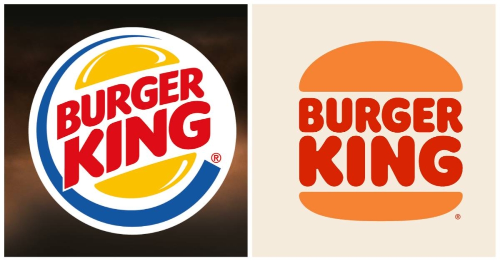
Going back to the basics was the direction for Burger King’s new old logo that made a comeback after nearly three decades.
The American fast-food chain unveiled a new logo last year that was inspired by its older flat-design logos from the 70s and the 80s.
The refreshed logo saw the synthetic blue swish removed to be aligned with the brand’s decision to move away from artificial colouring, flavours and preservatives.
The brand also changed its font to give it a modern look with more rounded edges, which is inspired by their food.
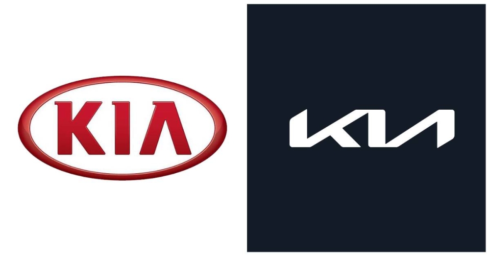
It took Kia a major logo revamp to introduce a fresh image in line with the brand’s new direction of “movement that inspires”.
In the new logo, the Korean auto giant ditched the oval outline that stayed with the hallmark of the Kia badge from 1994 until last year.
It also resembles a handwritten signature in an angular font with unbroken lines representing “moments of inspiration”.
The automaker also changed the red-on-white logo theme to a black-and-white colourway, resembling a futuristic vibe.
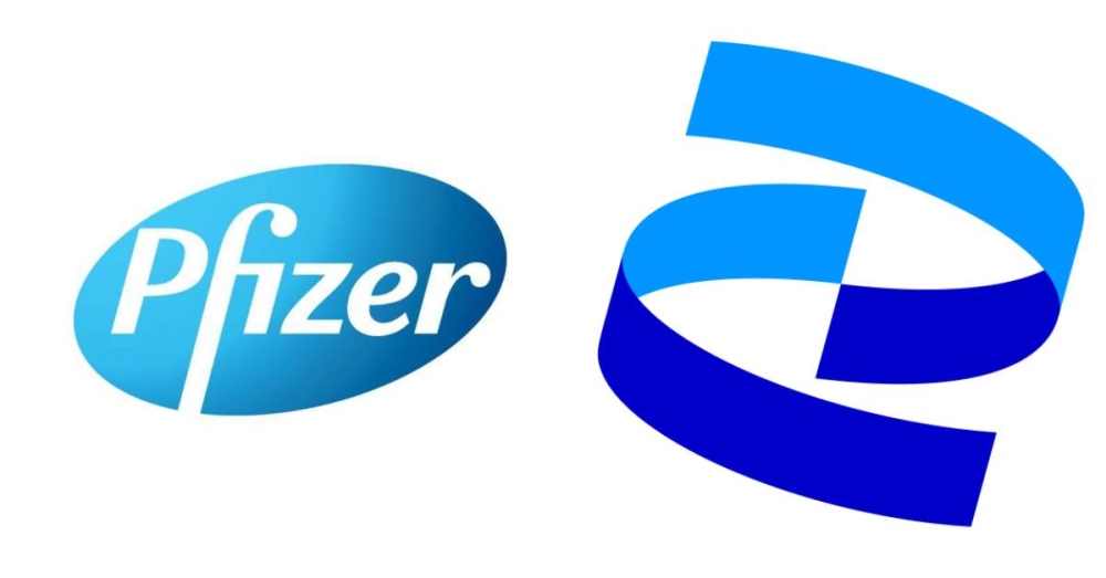
Pharmaceutical giant Pfizer is no stranger to the world following its involvement in the Covid-19 vaccine manufacturing over the past few months.
Last year, the brand launched a full rebranding exercise to emphasise its focus on sciences while doing away with its blue pill-shape logo.
The new logo features a double helix spiral, resembling the shape of the human DNA.
The new logo, which marks the first major redesign for the brand in 70 years, symbolises Pfizer’s departure from a commerce-based healthcare firm to a full-fledged science company dedicated to eliminating diseases.
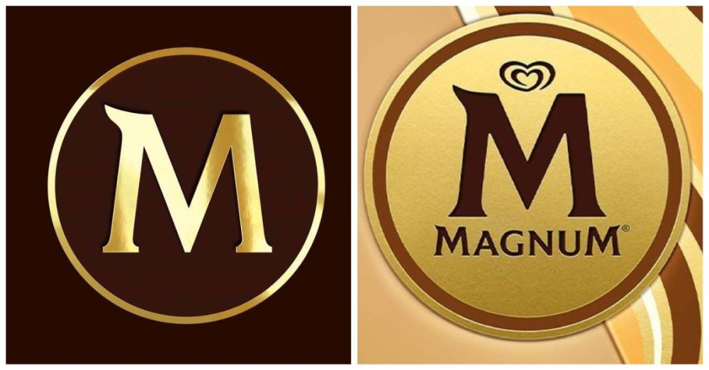
Unilever’s ice cream brand Magnum went through a major redesigning exercise to introduce a new logo and packaging with a “more liberated and contemporary” theme.
The move aimed at shifting Magnum as a “liberated force of pleasure” — seemingly changing its association with luxury and exclusivity.
The logo shake-up features a new signature diagonal line with softer typography and a matte colour scheme.
The gold iconic “M” stamp is cloaked in matte chocolate brown against a metallic yellow background in a reverse of the previous design.
Unlike the original design, the bling is ditched from the new logo, paving way for a clean contemporary concept.
Generally, the recent logo redesigns by giant brands saw cleaner, bolder and easily read logo fonts.
Many brands also ditched the circular containers or extra lines to make their logo simpler with fewer distractions.
There are also some brands that introduce special occasional logos to commemorate an anniversary, collaboration or a momentous event.
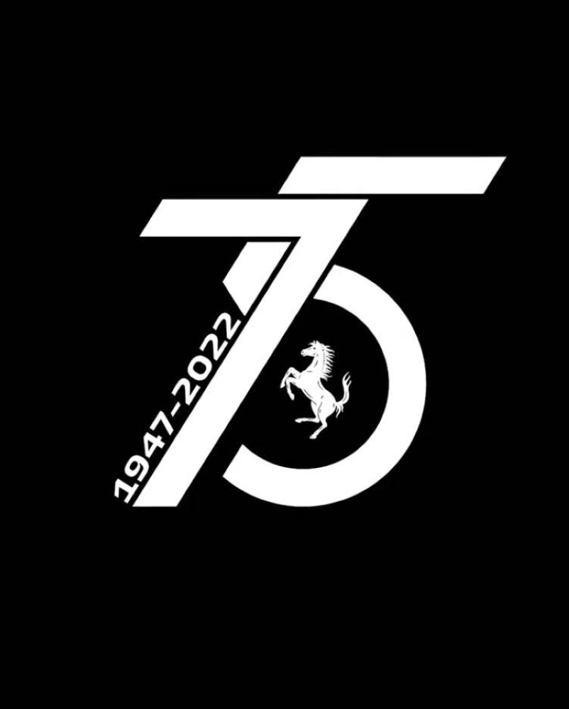
Italian luxury sports car brand Ferrari recently unveiled a special logo design to celebrate its 75th anniversary this year.
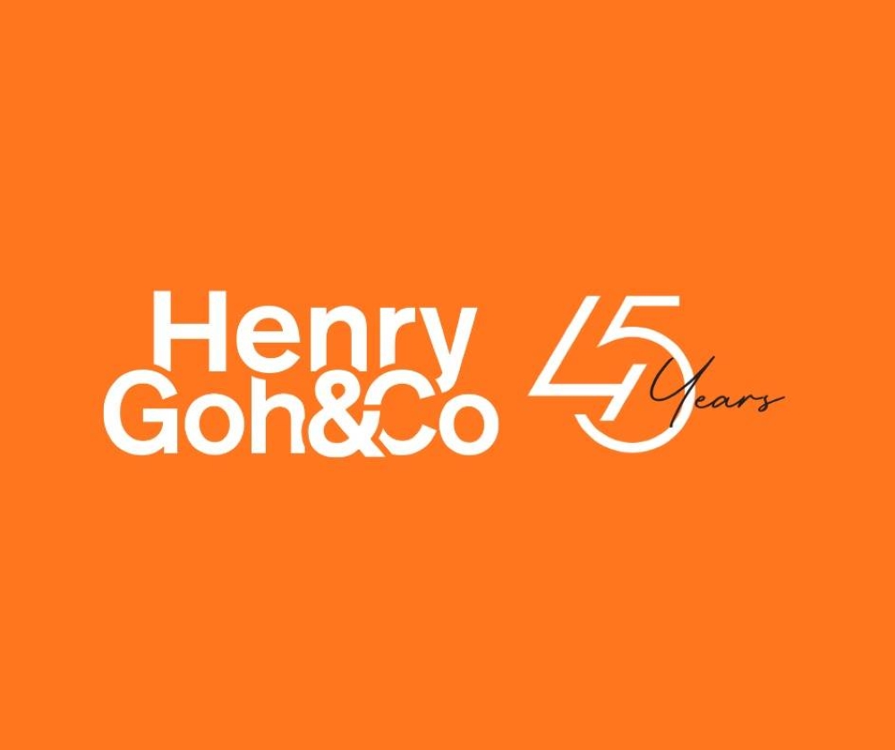
In Malaysia, pioneer intellectual property protection firm Henry Goh & Co has also unveiled a special logo to commemorate 45 years of excellence.
With new trends emerging, more logo redesigns and rebranding are expected from big names as they fine-tune their strategies to adapt their brand identity and fit the times.
To gain more knowledge about intellectual property protection, surf over to the Henry Goh & Co website here.
")


